

The English Countryside
initially through the eyes of Sam Contis
Whenever my wife and I are on vacation, we make it a point to visit a bookstore or two. I’ve always thought a book was the perfect souvenir to take back home. The perfect reminder of when and where it was chosen.
Fittingly, during an afternoon spent with some of my wife’s family in London, we decided to go to a bookstore they had recommended before getting dinner. Once we got there, I naturally followed the signs and flights of stairs to the best corner of any bookstore: the photography section.
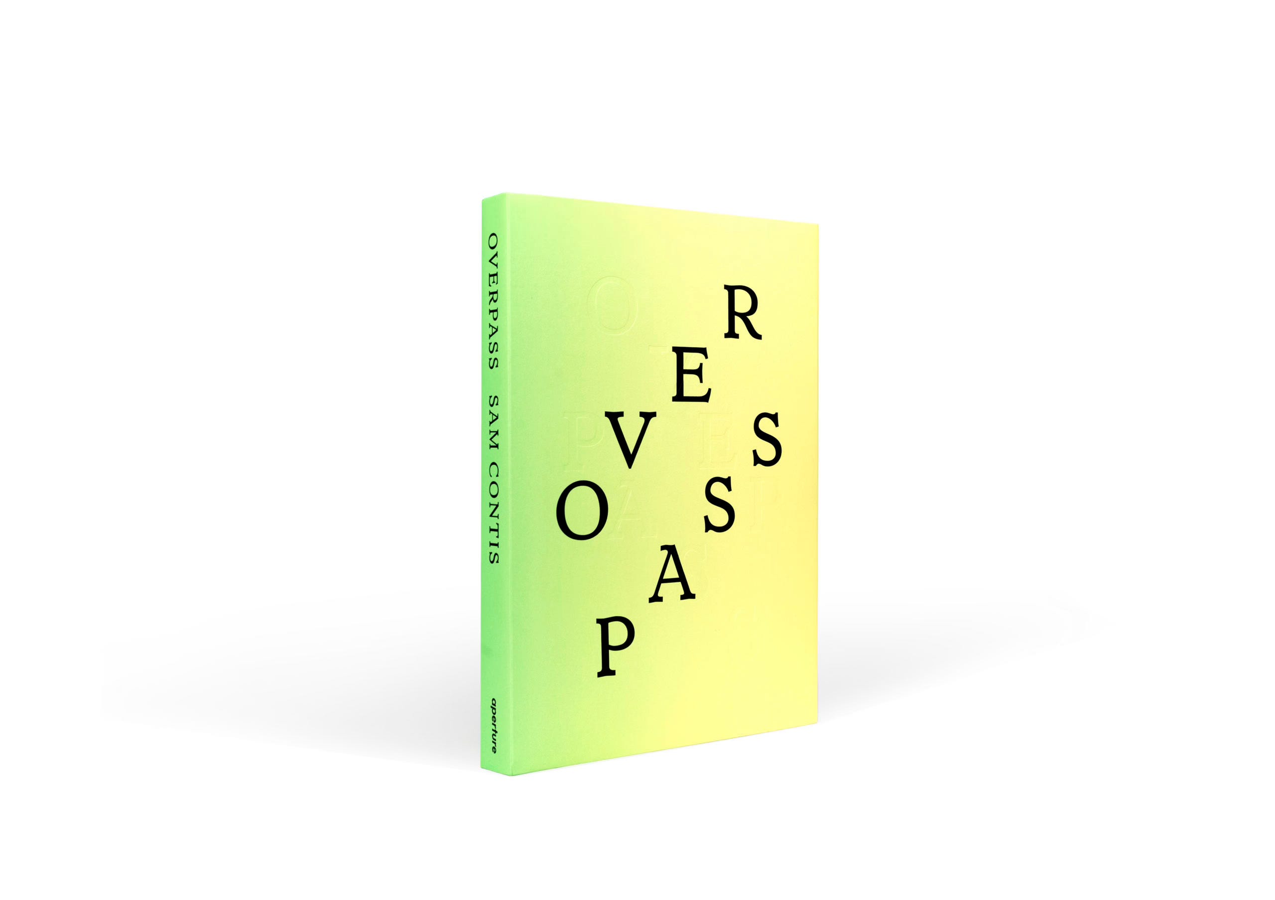
After fast-walking to the jam-packed corner of photo books, I tilted my head in order to read the spines. After a few minutes of scanning and flipping through some of the books, I was stopped by a bright, greenish/yellow color with bold black letters. My brain had registered that color and font before from a website in the past. In fact, I remember putting this particular book in a digital wishlist but for some reason I never ended up buying it.
That book was Overpass by Sam Contis.
I pulled it from the shelf and found that it was shrink-wrapped which felt unusual for a book that was in a physical store. Oddly enough, there were photographs from it that were engrained in my head over the past few months and therefore I didn't NEED to preview the pages before buying it like I normally do. I trusted that this book was full of inspiring work. It just felt right. And timely. The shrink-wrap mimicked a wrapped present for myself; a present to tear open once I was ready to digest the photographs.
And since we did not have time to adventure out into any parts of the English countryside during this particular trip, it was as if the universe was telling me that this was how I was going to experience it this time around: through the eyes of Sam Contis.


A trip to the countryside that I could retake again and again whenever I opened it up..
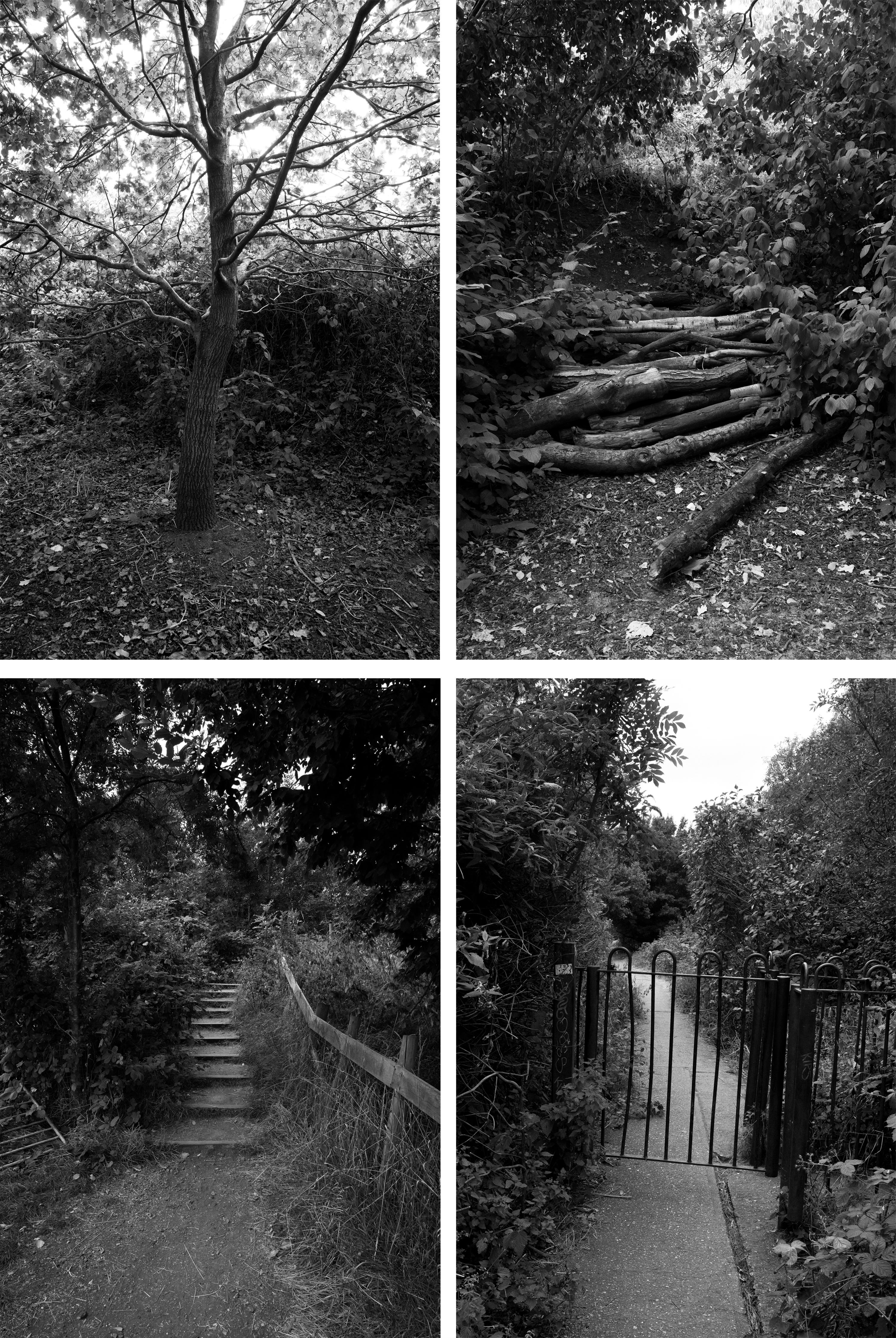
“When you step down from the stile the ground comes up fast. There are these trippy images of movement, interspersed with the wide, still spaces. The perspective has been shifted, as though the subject is on the move. They give the feeling of descending to finding the ground slightly closer and harder than you'd expected, stumbling. All forms are dappled and blurred, meshed with light that moves unstably in water, earth, branches, or bark. These images are preoccupied with shadows and reflections, the places where branches and walls allow light to pass. Water rushes through the teeth of a barrier that catches flotsam. Barbed wire runs right up to the place where the fence can be crossed, then runs on at the side. Many of these pictures spell out the shape of the letter H: a horizon-line, seen between vertical strokes of trees or fences or walls. Planks, stones, wires, gates, stiles, fences, walls, all arrange a horizontal barrier or bridge that spans two uprights. I typed the lone letter into a search engine and discovered that my inference ran in the wrong direction: it's not the landscape that recalls the letter, but the letter that depicts a landscape: "H" is derived from a Levantine hieroglyph for fence. A stile is a means of access but it is also a barrier technology, like a subway gate. It selects. It discriminates. It filters bodies.”
–Daisy Hildyard [from one of her two essays in Overpass]
—
The following day, I did get a little taste of the English countryside in a way when my wife and I took the ferry and bus over to a peninsula in East London known as the Isle of Dogs. The sun decided to slightly shine through the grey as we wandered through an overgrown park and farm. It was the perfect little escape..

That book has also been on a wishlist of mine! Great find man 🤍
Oh, this looks fabulous! Thank you for sharing.